this is the design page. to view the projects in more detail you'll need to access the flash version of our site. see the top of this page for details.
striped pebble
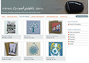
A new site for Jane, Vic and me to showcase and sell linocuts, drawings, paintings and handmade cards.
Images: 3

greaves brewster
An update and rebrand of our original identity work for intellectual property specialists to coincide with an office move. Redevelopment of stationery, brochure and website.
Images: 4
electric december 2011
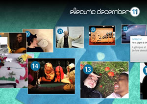
We were delighted to be invited to redesign Electric December for the 4th consecutive year. This year's calendar used a rotating jQuery carousel.
Images: 3
beaford archive
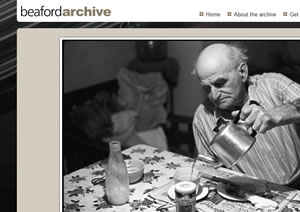
A gallery site documenting James Ravilious' brilliant photographic portrait of rural life. Interactive maps allow visitors to browse the locations where the images were taken.
www.beaford-arts.org.uk/archive
Images: 4
brighton pier
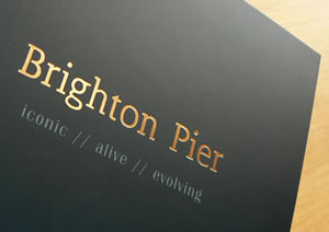
Brochure to sell the iconic Brighton Pier featuring special stock, foil block and UV varnish detailing.
Images: 4
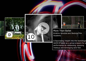
electric december 2010
Our third year for the annual festival of short film making by young people organised by Bristol's Watershed.
Images: 3
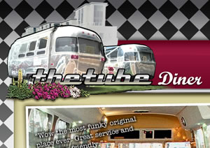
paintworks diner
Identity, brand elements and mini site for the iconic 50s style Airstream dining cars that provide a micro-cafe for workers and visitors to Paintworks, Bristol.
Images: 3
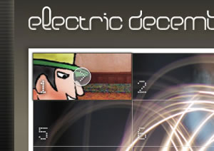
electric december 2009
Following the success of our site for last year's Electric December, the team at Bristol's Watershed asked us to revisit the site within a tightened budget. Many thanks to Design Week and The Drum for featuring the redesign on their hallowed pages.
Images: 2
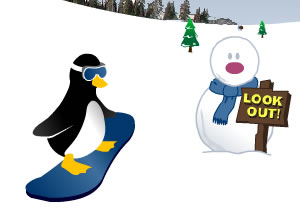
snowboarding penguin
Festive tomfoolery for our friends at Greaves Brewster. Guide the penguin down the mountainside avoiding all the Intellectual Property pitfalls and obstacles along the way.
Images: 3
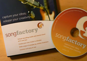
song factory
Identity, packaging and various UI ingredients for a nifty piece of songwriting software aimed at guitarists. Just drop in the chords of your emerging idea, drag and drop some band parts and suddenly you have a backing track played by session musicians to record over, experiment with or burn to CD.
Images: 4
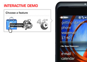
toshiba tg01 demo
Delighted to be invited by local big hitters E3 to design and produce an interactive Flash demo for Toshiba's TG01 smart phone. The click-through sequences use navigation cues from the phone's interface, and adapt to accommodate several European language translations.
Images: 3
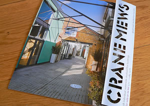
crane mews
Identity, mailer, brochure and website for a gorgeous regeneration of 18 riverside studio/offices in Twickenham by Verve. The punched glaser stencil word marque reinforces the notion that each of the units are individual self-contained buildings and everything is designed to make full use of Tom Lee's cracking photography.
Images: 8

electric december 2008
We were delighted to be chosen from a shortlist of 4 agencies to develop the identity and site for the 10th incarnation of Watershed's online calendar. ED08 features 24 short films made by young people in more than 10 European locations.
Images: 3
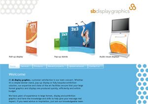
sb display graphics
Crisp identity and CMS website for an exhibition, display and large-format graphics supplier. The solid grids of circles suggest dot screens while the sb marque, built on the same structure, echoes the passage of substrate through the machines.
Images: 4
beaford arts
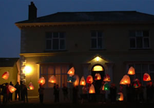
We were approached by Beaford Arts, a charity established in 1966 to promote the arts in north Devon, to reassess their online presence. The new site fully showcases the richness of their work, including performance programme, residential courses and vast photographic archive.
Images: 3
loose collar fairies
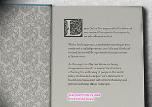
A little Flash-based fairytale whimsy for a company offering magical seated massage therapy in event, party, club and corporate settings.
Images: 3
signboard
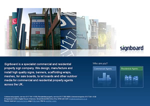
Following the success of our first version of their site, Signboard asked us for a new version. A CMS back-end makes it easier for them to add and update new projects and galleries, while the mailing list keeps clients and prospects up to date.
Images: 3
calpol cabinet
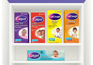
An interactive 'medicine cabinet' for the Calpol website (now sadly decommissioned), designed by our fine friends at Beef, which we brought to life in Flash, with a search-engine friendly xhtml file to hold the text.
Images: 1
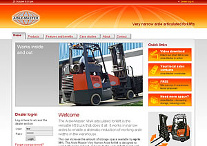
aisle-master
Website for a forklift truck manufacturer in Ireland. The ingenious 'articulated' design allows for a significant reduction in aisle-widths allowing up to 50% more storage space in the warehouse.
Images: 3
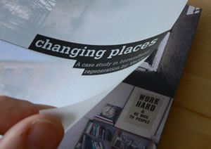
verve case-study
A self-promotional brochure for Verve Properties to explain their knack of transforming humble, disregarded buildings into vibrant mixed-use communities. Richly textured pairs of 'before and after' images are overlaid with translucent sheets that carry the story. Printed on tactile, textured stock and wiro bound with a slipcase.
Images: 5
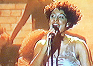
corinne bailey rae backdrop
Thanks to Annie at Steel Monkey and John at Signboard for the chance to play a tiny part in the Brits 2007. The set design for Corinne Bailey Rae, inspired by 1970s street parties, called for this sepia-toned 25m x 7m illustration of a brick wall complete with ripped flyposters, pseudo 70s graffiti and a Leeds street name.
Images: 4
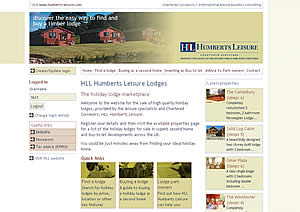
www.lodgesales.com
A new site for HLL Humberts Leisure to promote and sell timber holiday lodges. Styled in line with their main site, the site had to appeal to both consumers and lodge park owners. A user log-in system enables sales enquiries to be tracked by HLL.
Images: 3
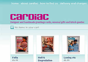
cardiac - kitsch and retro cards
Retail identity and online store for a cracking retro card and gift shop on North Street in Bristol.
The website is built using the brilliant Shopify by the good people at Jaded Pixel, with a custom theme.
Images: 5

christmas radio times
Series of online overlays, skyscrapers and MPUs for the institution that is the Christmas Radio Times. Running alongside an existing magazine ad the aim was to highlight the 2006 promotion of free Dr Who audio books.
Images: 1
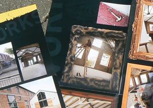
paintworks bristol
A former Victorian paint factory, now thriving art, design and media quarter. Work includes visual identity, a series of roadside boards, fold-out brochures and an a online community for the development - all run through with Verve's unconventional voice.
Visit www.paintworksbristol.co.uk
Images: 9
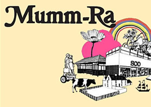
mumm-ra
Our friends at Beef asked for a little Flash quirkiness for the website navigation of Sony BMG's Mumm-Ra. While they were together, absolutely without question the finest purveyors of irresistibly catchy indie-pop ever to come out of sunny Bexhill-on-Sea.
Images: 1
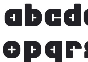
slot typeface
Developed as part of an identity proposal, this partially completed typeface is based on shapes inspired by a slot-assembly system.
Let me know if you're interested and I'll work up some numerals and punctuation!
Images: 1
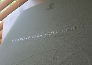
richmond park golf course
A brochure designed for HLL Humberts Leisure to attract a new operator for Richmond Park Golf Course. Textured uncoated stock, foil blocking and embossing gave it the proper gravitas for a Royal Park, while recycled materials and vegetable-oil based inks met the Royal Parks environmental policy.
Images: 2
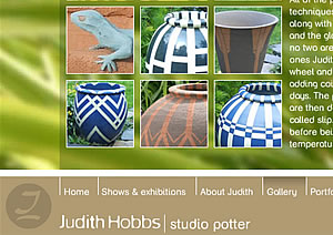
judith hobbs
When Bristol-based Judith Hobbs was accepted as an exhibitor at the RHS Chelsea flower show she approached us for a website and promotional materials. An identity based on her potter's mark was supported by a soft, tactile, custom typeface 'Hobbs rounded'.
Visit www.judithhobbs.com
Images: 4
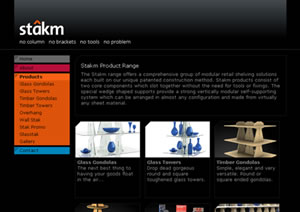
stakm.com
Identity and a simple website for a startlingly simple retail shelving solution. Stakm products rely on a patented construction system which uses just the shelves and some wedge shaped supports. No tools or fixings are required, and the more you load the shelves, the more rigid the structure becomes.
Visit www.stakm.com
Images: 2
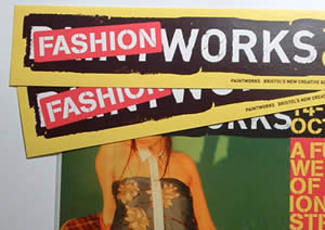
fashion-works at paintworks
A weekend of fashion and street culture held at Paintworks, Bristol in October 2005. A goodie bag given away at the event included a half-bottle of 'Brilliant White' with "Fait exactement ce qu'il dit sur la bouteille" on the label which still makes me smile.
Images: 3
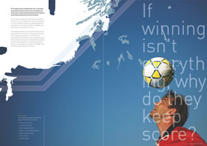
ap thompson brochure
Proposed brochure cover and spreads for a sports surfaces specialist.
Images: 3
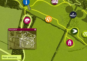
thistledown site plan
Interactive site plan developed with Sea Creative for Thistledown, a proposed visitor attraction in the Cotswolds due to open in 2007. Visitors to the website were able to explore a map of the site and learn about the planned archaeological, ecological and farming exhibits & attractions.
Images: 1
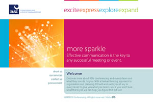
bsi confer-encing
Design and copywriting, together with an energetic colour palette and a smattering of Flash was our way of giving this conferencing company a little more sparkle.
Images: 3
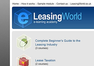
leasing world e-learning
Series of icons for an e-learning academy offering training courses for asset finance and equipment leasing professionals.
Images: 1
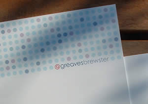
greaves brewster
Corporate identity for this small but perfectly formed Intellectual Property practice based in Cheddar. The project included a new marque, brochure, stationery, building signage, presentation materials, an exhibition stand and a CMS website.
Images: 3
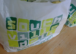
southville deli
Retail identity to launch an independent deli on Bristol's busy North Street, which has quickly become an essential part of Southville life. A flexible logo was reinvented over carrier bags, shopfront, store posters and a super-simple website.
Images: 4
Oops
Our site is best viewed in Flash. If you are viewing this page then either you have javascript turned off, or you need to upgrade your Flash player.